Logo Design
✴
Logo Design ✴
Cure Soil
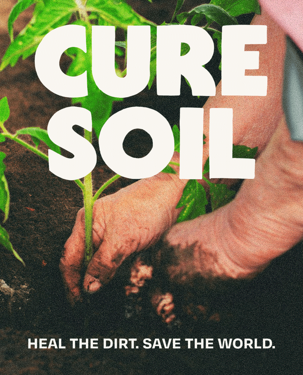
Cure Soil is on a mission to restore what industrial agriculture spent a century dismantling: LIVING SOIL. They’re doing this through biodynamic compost that replenishes the minerals in your soil and works towards rebuilding a healthy food system.
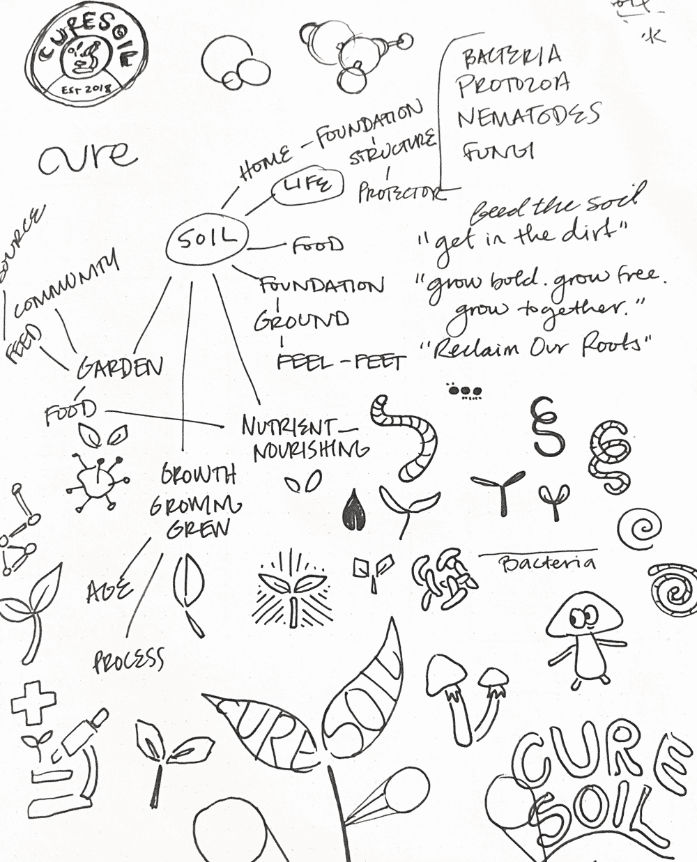
Process + Thinking
Problem : Lorem ipsum sit dolor amet. Lorem ipsum sit dolor amet. Lorem ipsum sit dolor amet. Lorem ipsum sit dolor amet.
Solution : Lorem ipsum sit dolor amet. Lorem ipsum sit dolor amet. Lorem ipsum sit dolor amet. Lorem ipsum sit dolor amet.
-
Protest. Resist. Reclaim. Regenerate.
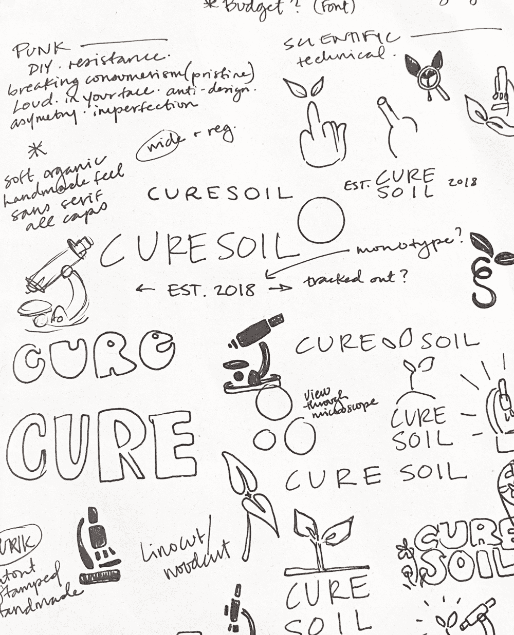
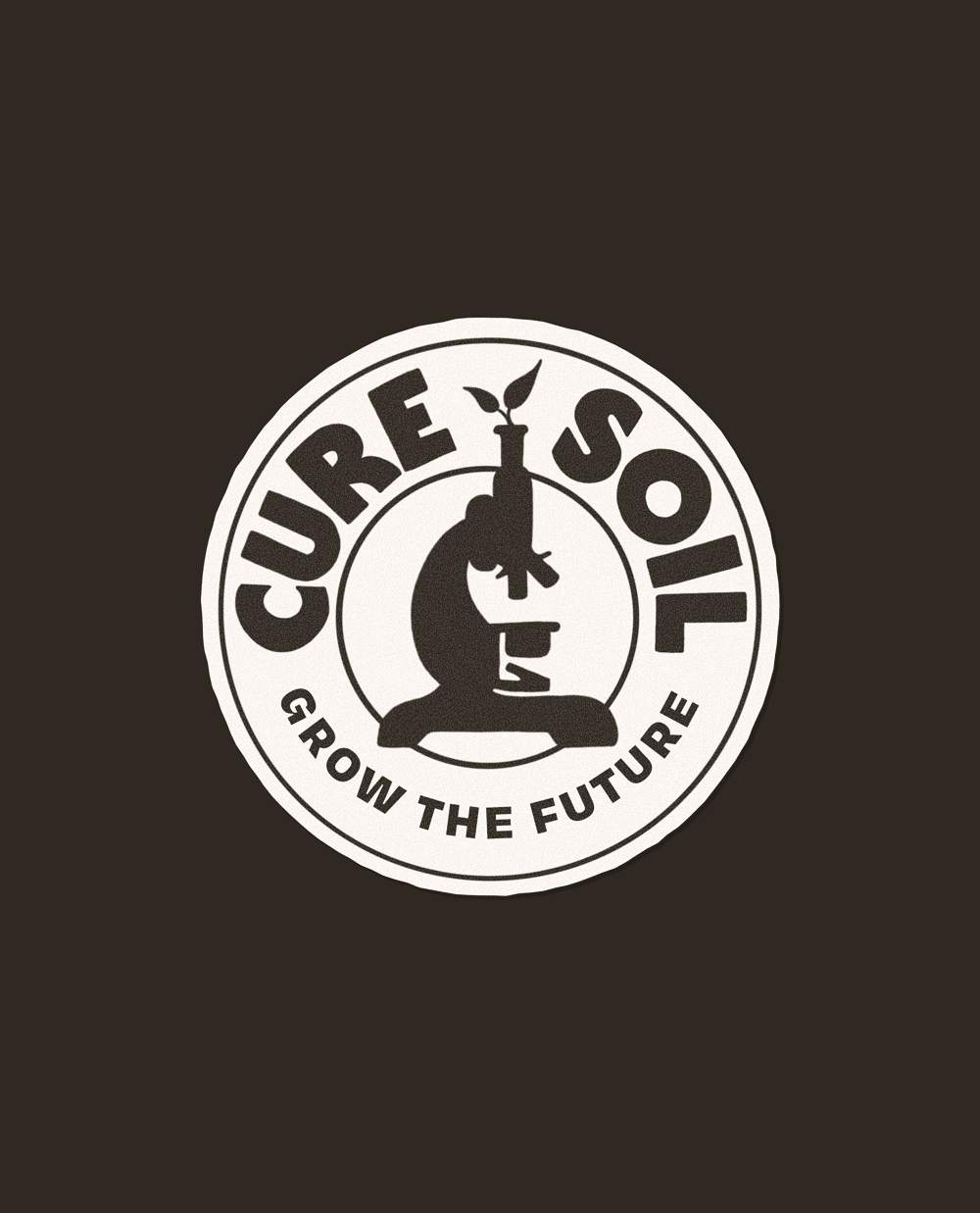
This mark sits in the space where punk and hippie come together to rise up against the man and give back to the earth and their communities. I wanted to capture the feeling of protest signs and DIY punk zines, bold and imperfect, while also evoking a feeling of nature and nourishment through organic curves.
-
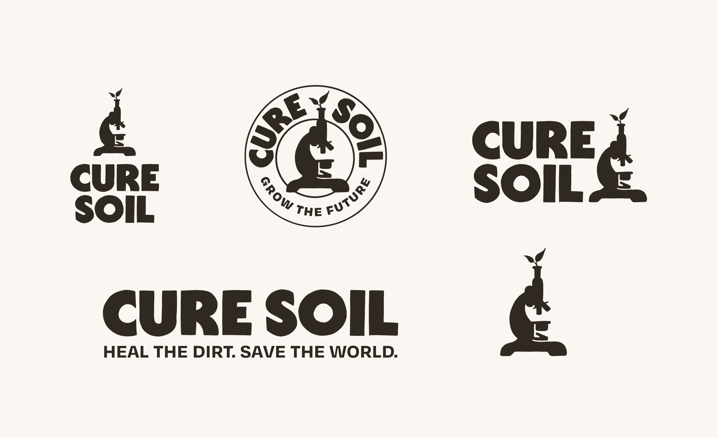
The overall letterforms are based on a chosen typeface, hand illustrated with some letter customizations to create a totally unique, imperfect mark with a handmade feel.
Wordmark: Cadet Black from Central Type
Tagline: Degular Text Bold via Adobe Fonts -
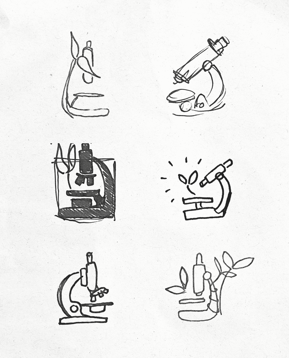
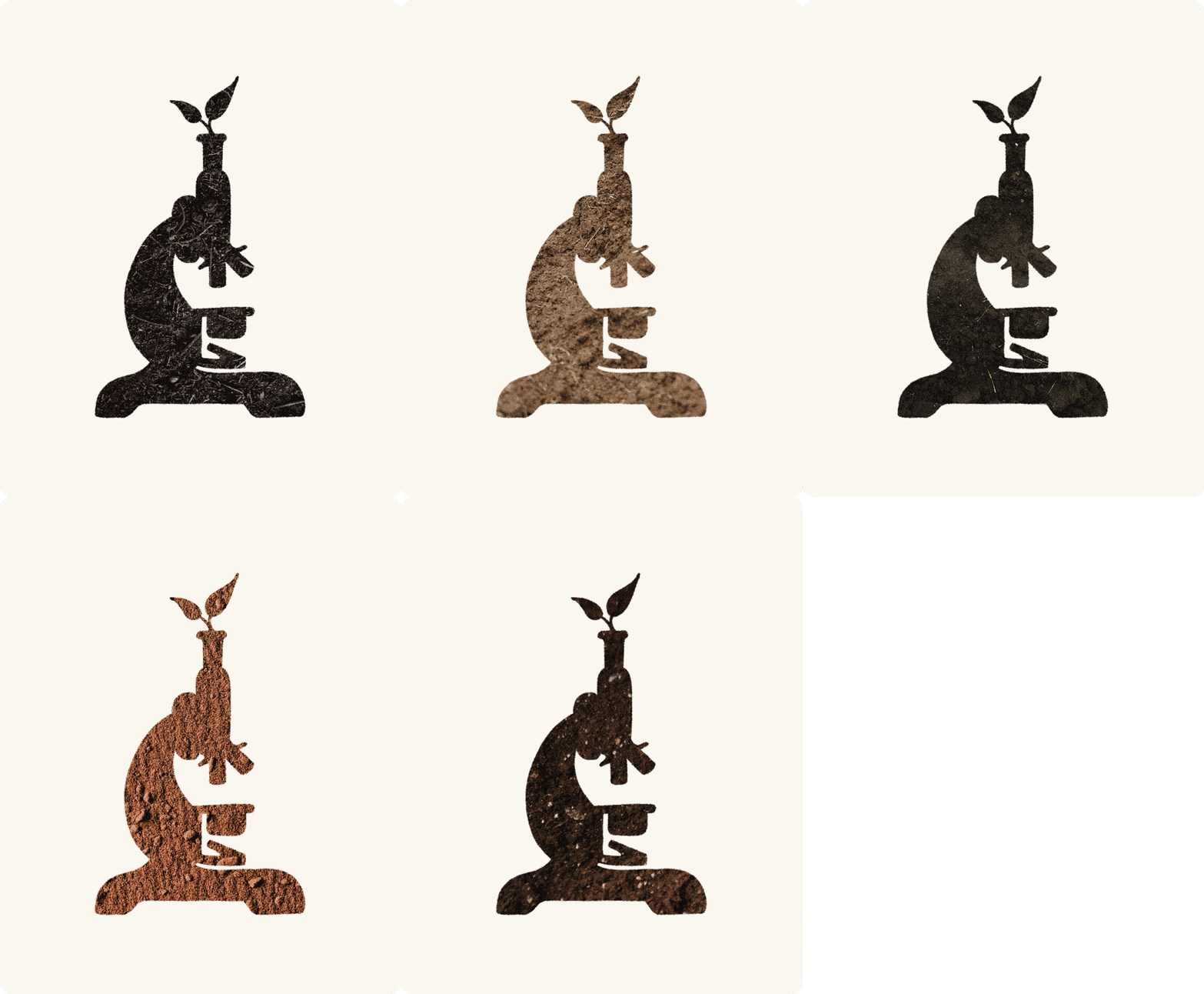
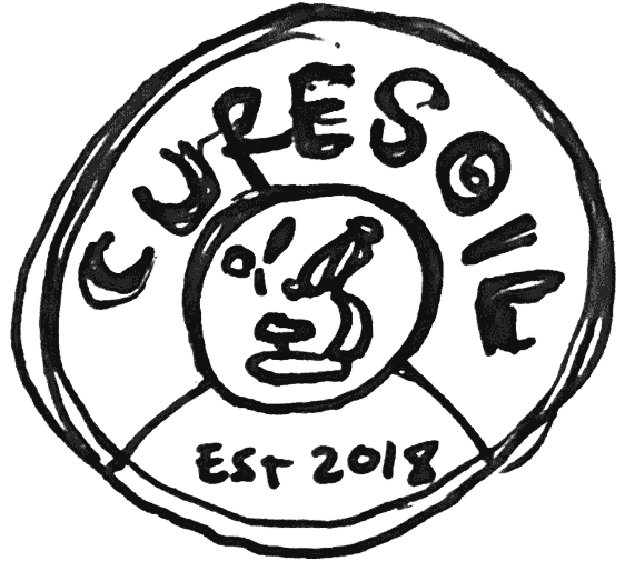
The icon has been refined to increase legibility and work cohesively with the new mark.
I’ve done this by:
+ simplifying the shape and number of details
+ relocating leaves to sprout out of lens (findings lead to growth)
+ refine shape of microscope to echo some of the curves and shapes within the new wordmark -
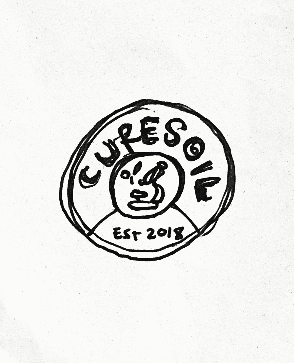
The general structure of the seal has been maintained in order to avoid consumer confusion when the new mark goes into effect.